Nood
Not every project starts with a blank page. Nood came to the studio already loved, one of Lisbon's most established Asian fusion restaurants, but a move to new locations meant the brand needed to evolve without losing the people who already knew it by heart. The brief wasn't reinvention, it was restraint: figure out exactly which parts of Nood's identity were untouchable, and which had room to grow.
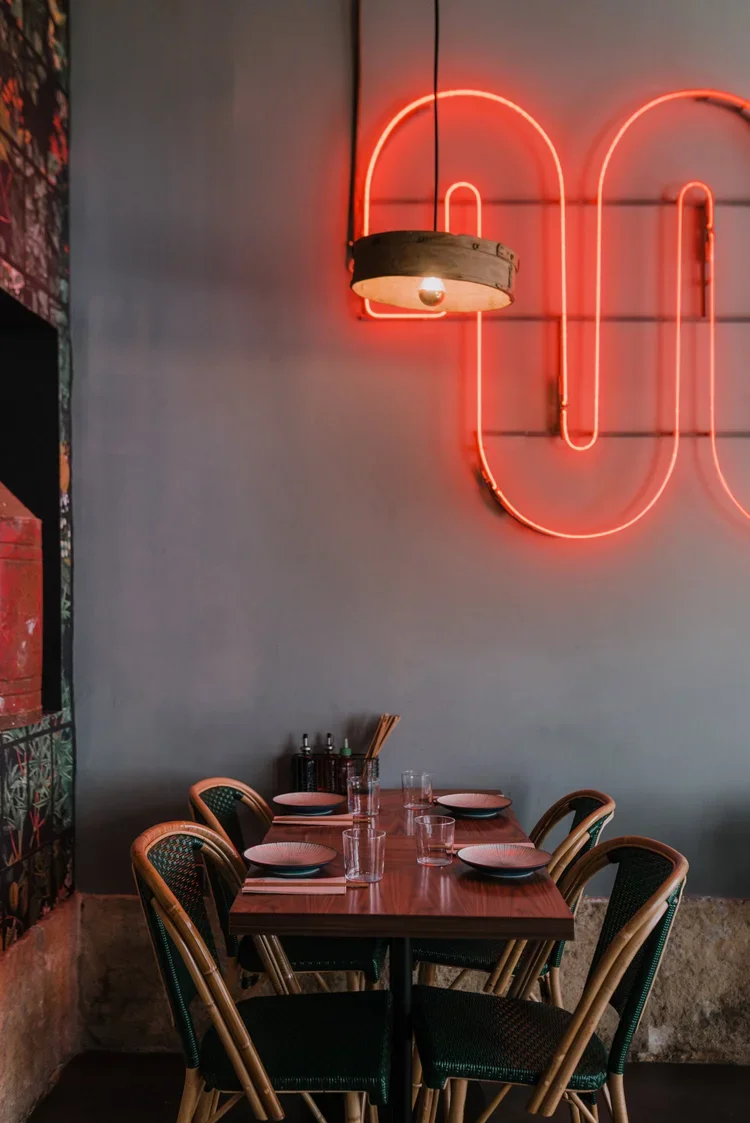
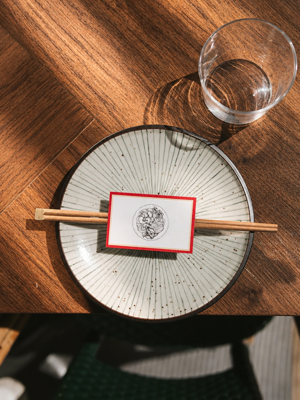
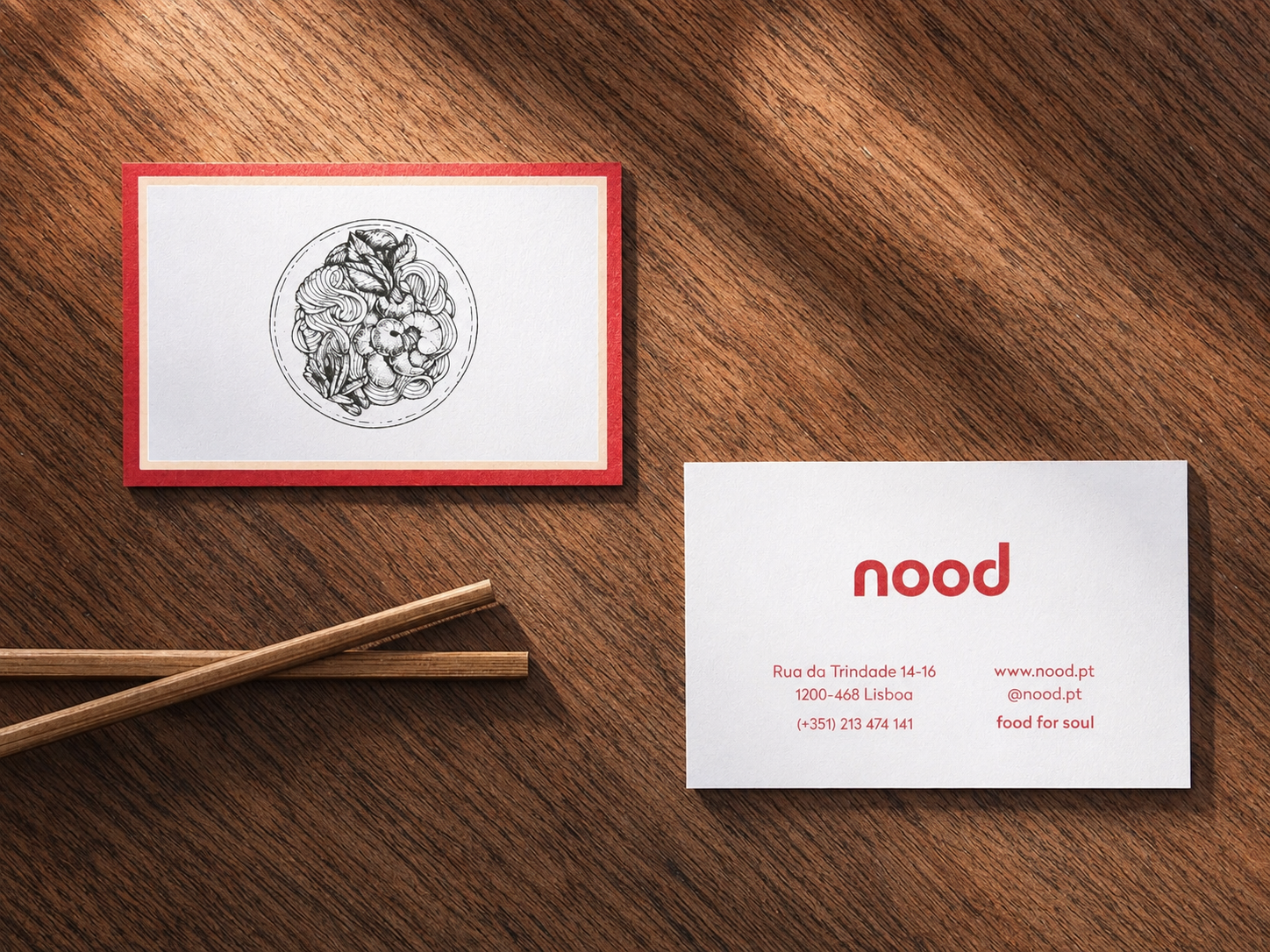
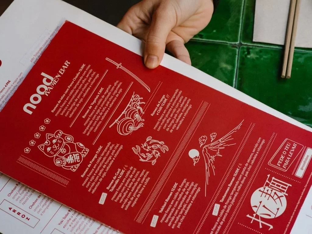
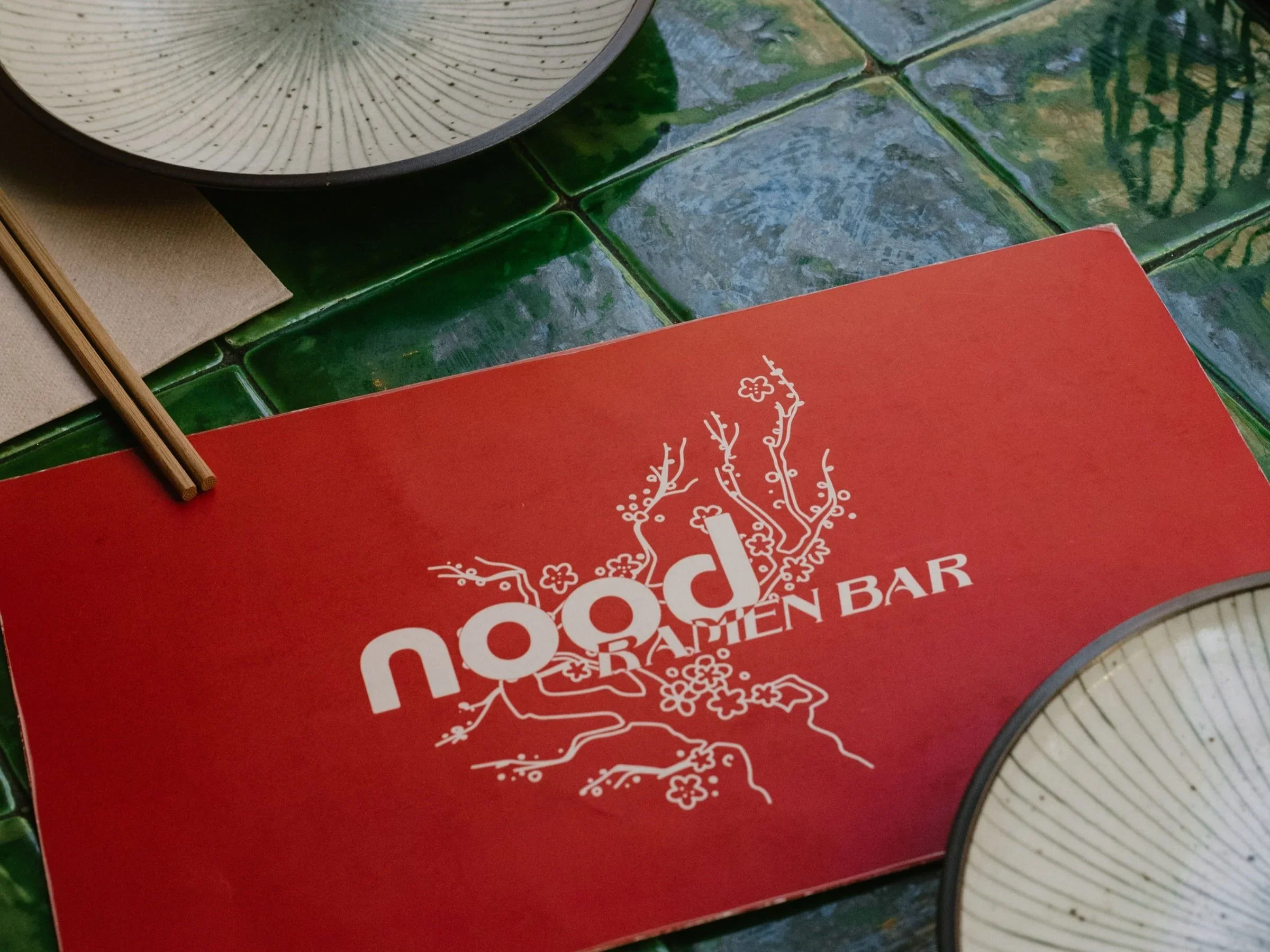
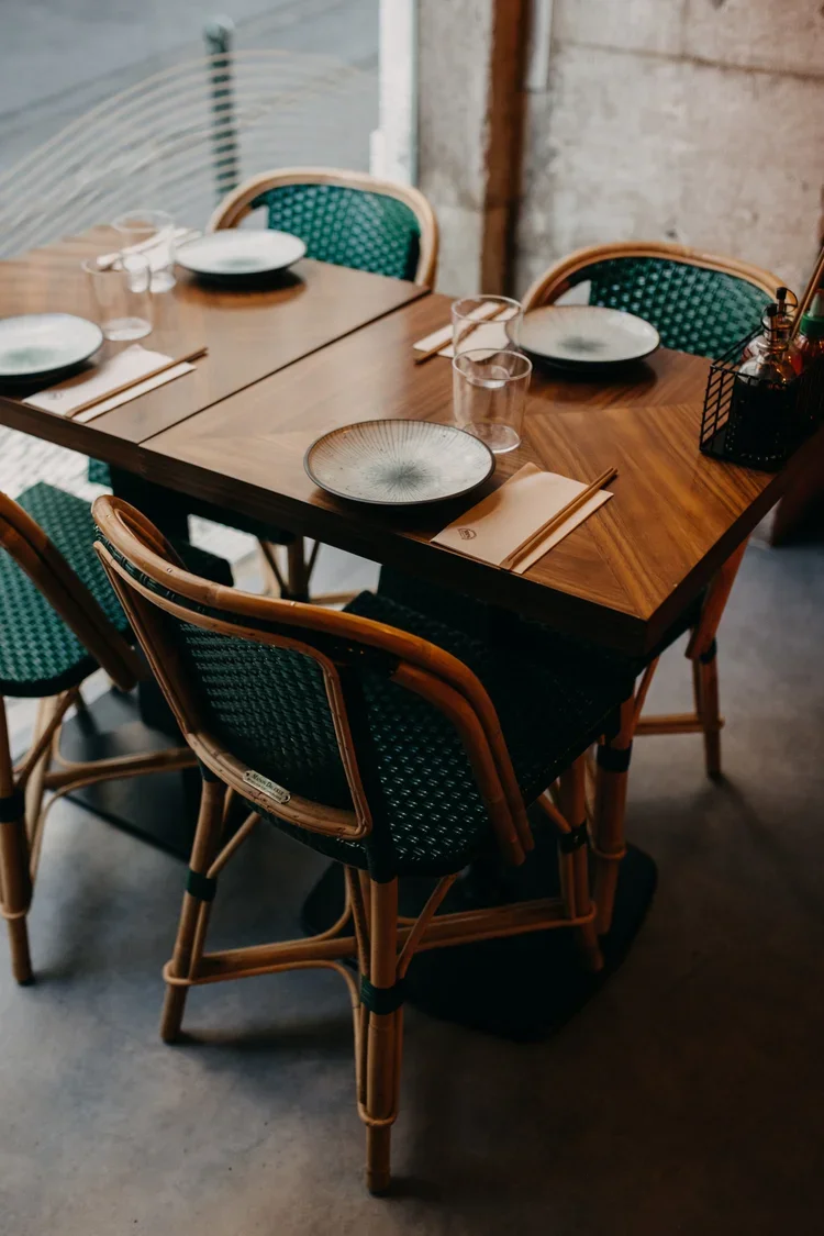
The concept itself drew from Asian street food broadly, a bit of everywhere rather than one single cuisine, so guests could taste across the region in one sitting. The space took the same approach: hard metallic structures and industrial fixtures set against warm colors and floral, tree-patterned wallpaper, a contrast that let the identity feel considered rather than themed. Working closely with Nood's own team, the signature red stayed at the center of everything, carried through business cards, opening-hours signage, and a menu rebuilt around the same color rather than replaced by a new one. Familiar enough for regulars to recognize instantly, refined enough to feel like an upgrade rather than a departure.
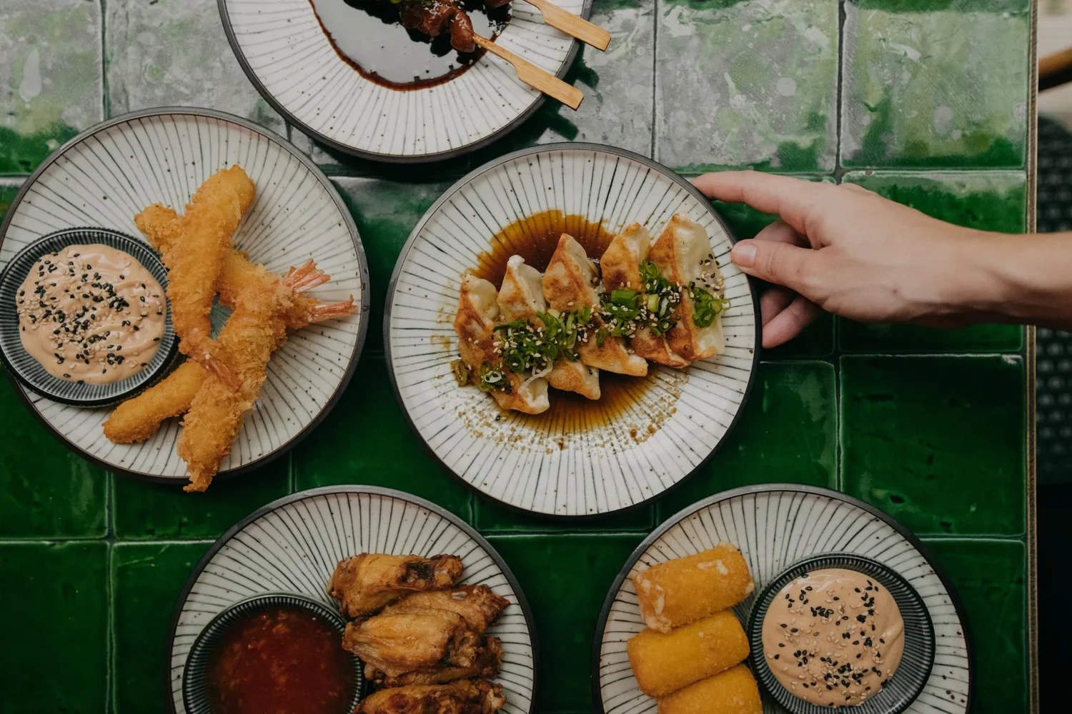
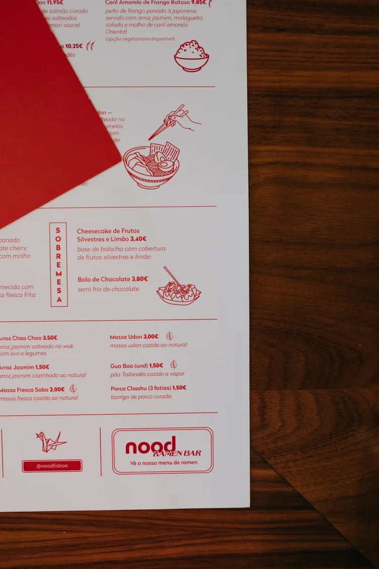
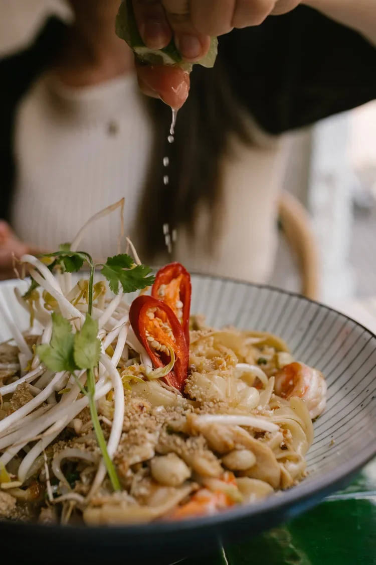
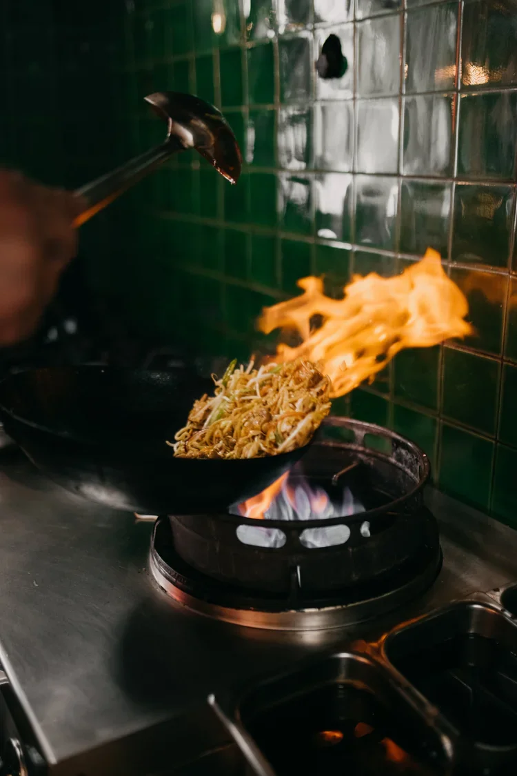
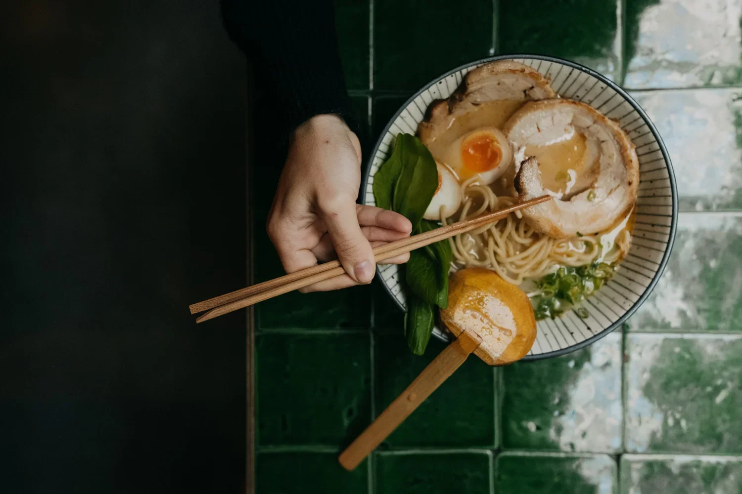
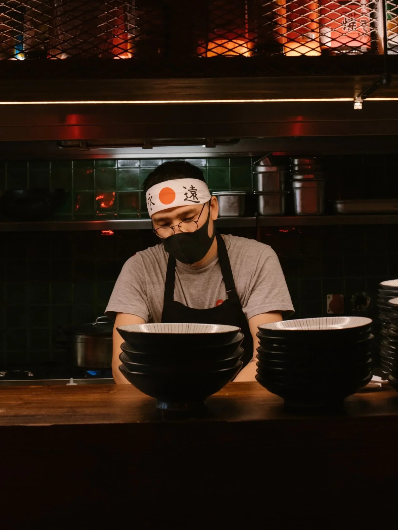
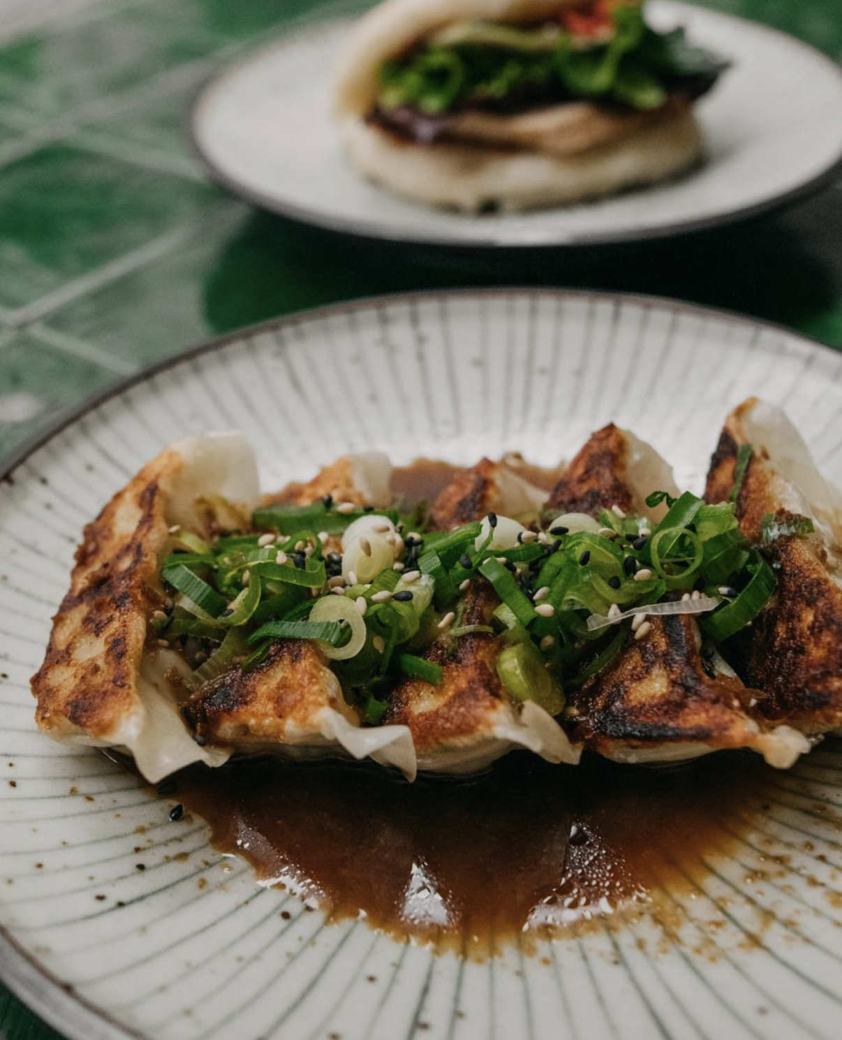
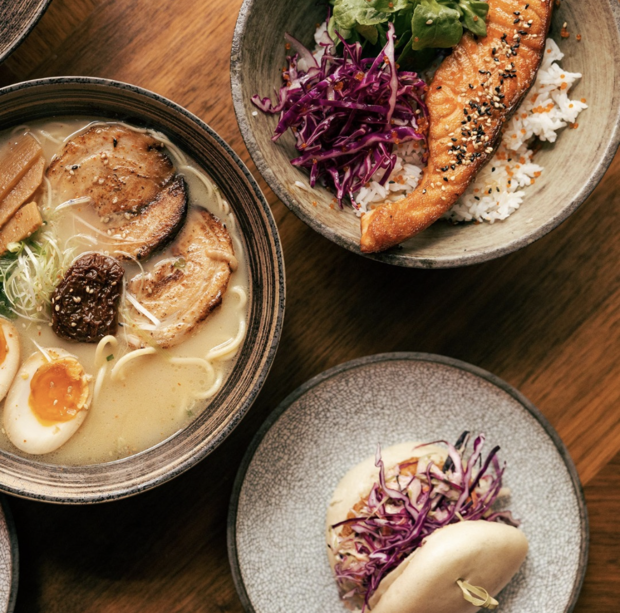
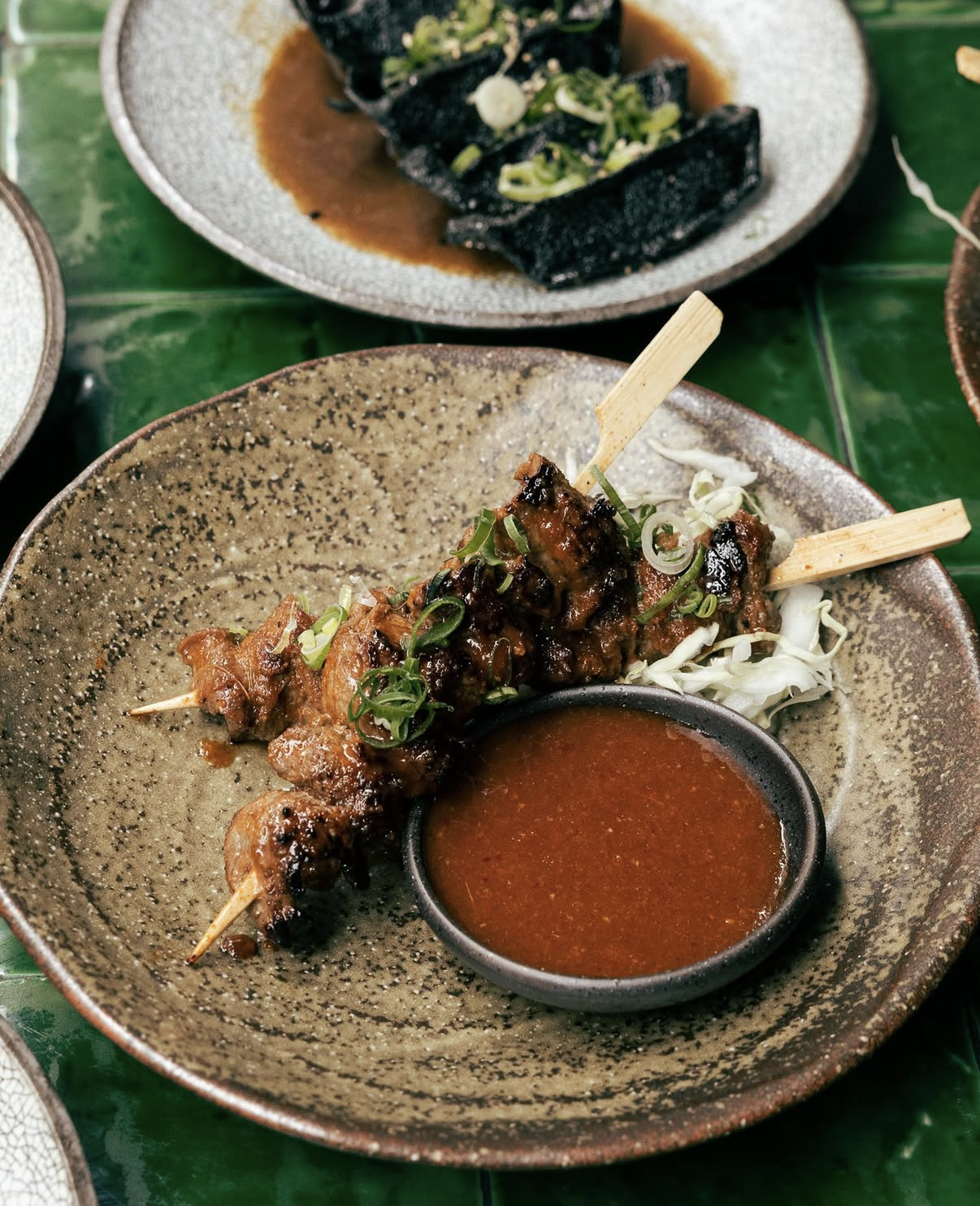
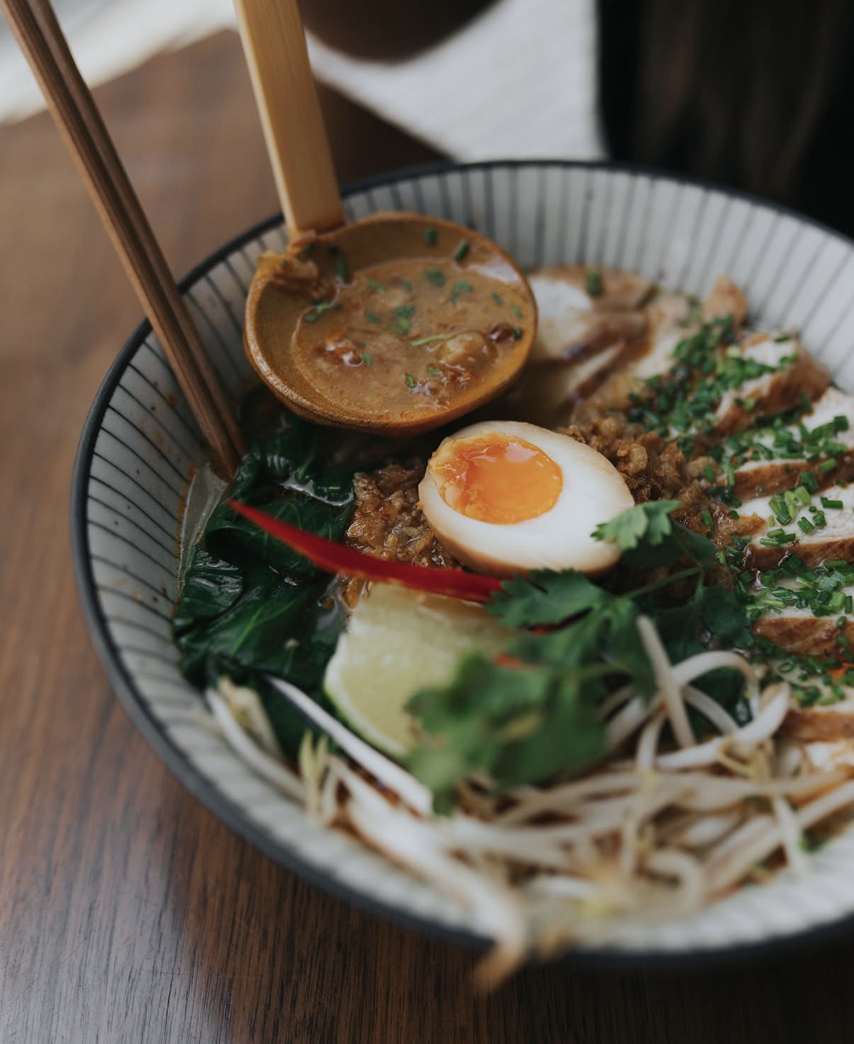
Same street-food breadth guided the menu itself, built with the clarity of Japanese minimalist design so it stayed easy to read even with that much variety on the page, illustrations doing the work that photography usually would. One addition came directly from the team: a dedicated ramen bar, built around chef Bruno's own exploration of different ramen styles, giving Nood a specific experience to be known for inside a much broader menu. The food itself was photographed with the same restraint, close, honest, letting the ingredients carry the shot rather than over-styling it.
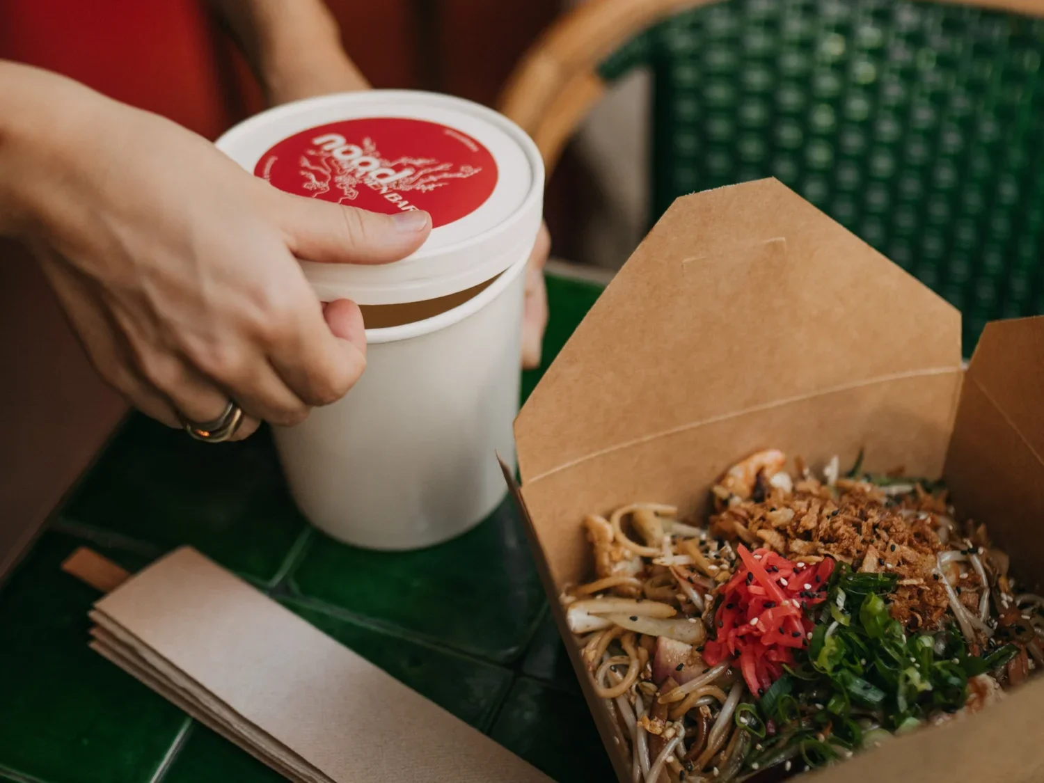
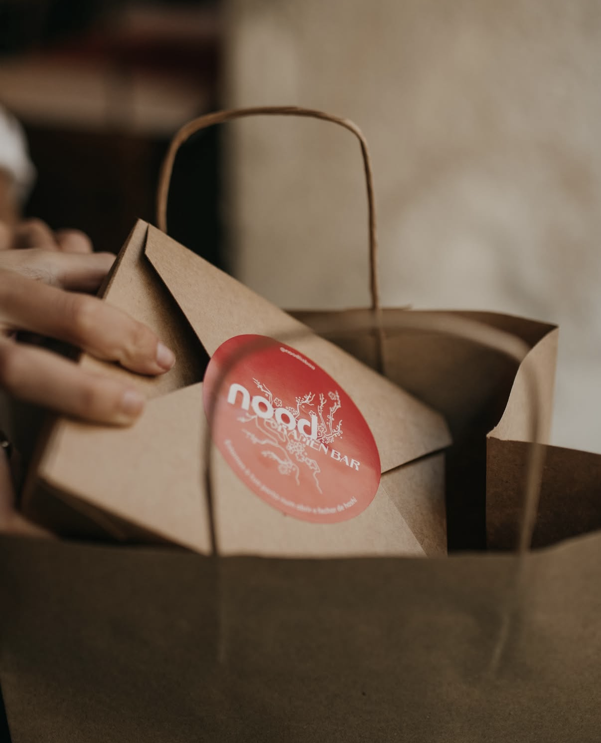
A sticker system for takeaway, small enough to apply to any container, consistent enough to carry the brand's red and mark wherever the food actually ended up.
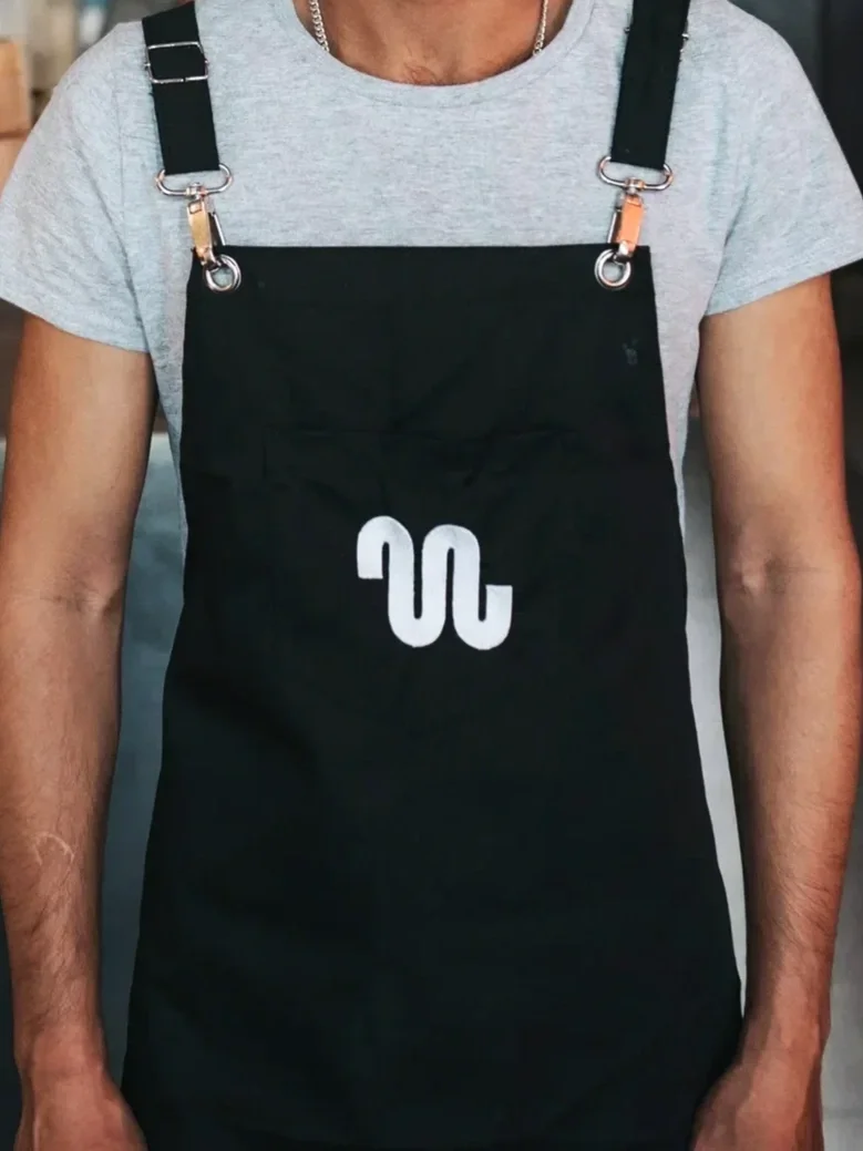
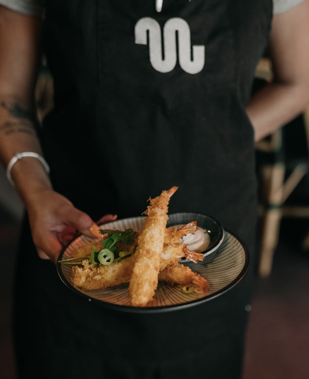
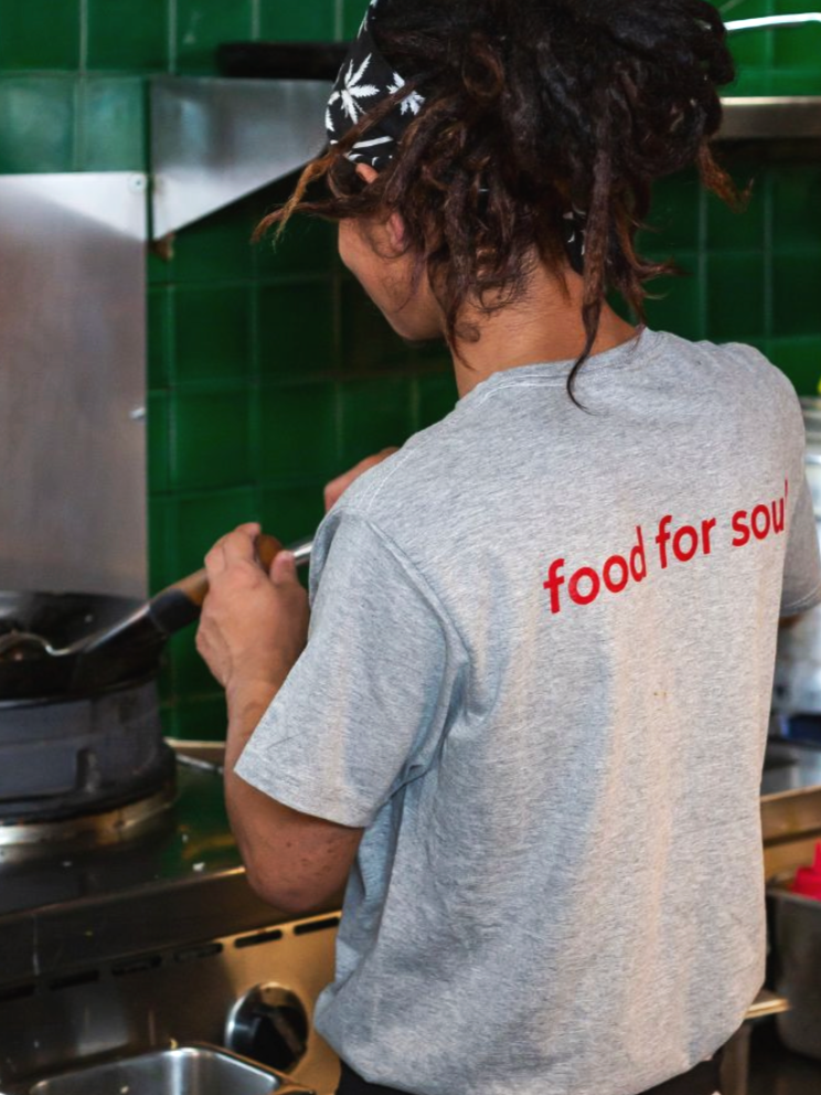
An apron and t-shirts, functional first, but built to make the people serving the food feel like part of the same identity as everything else on the table.
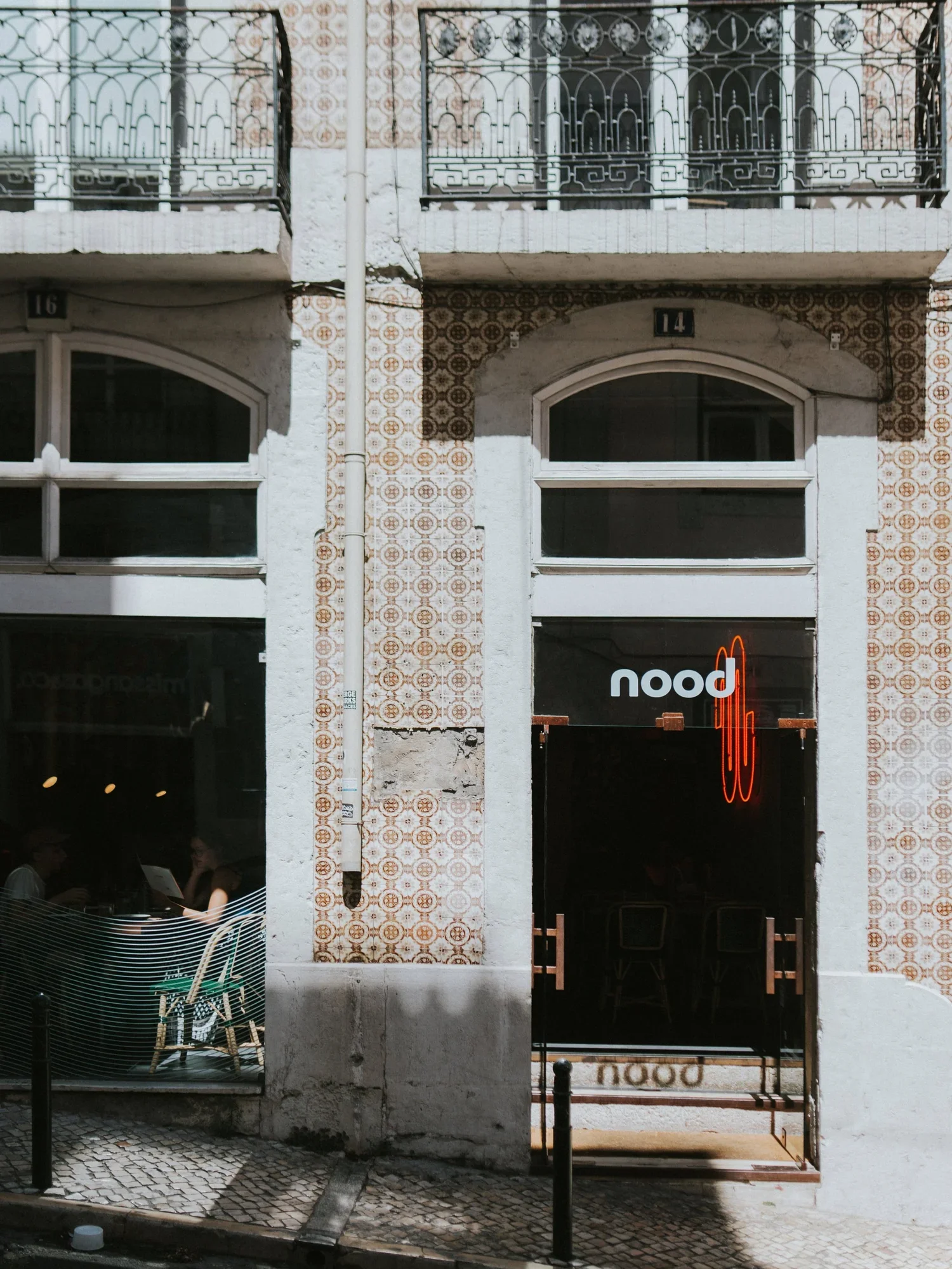
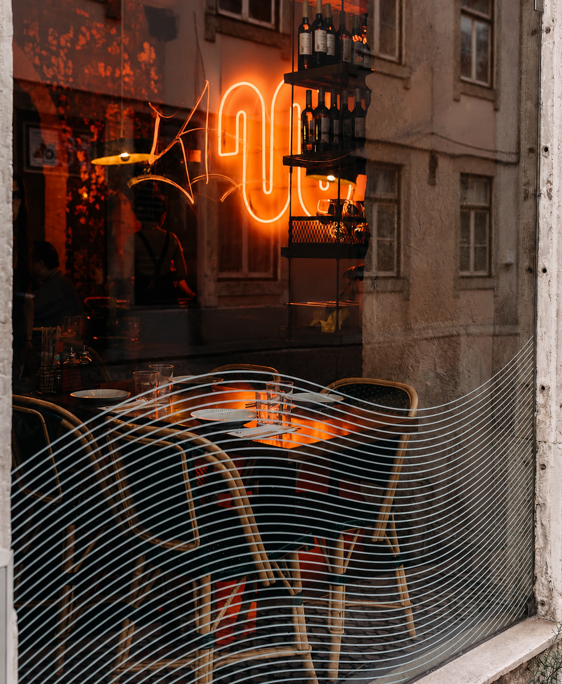
A large neon sign built around the logo's icon was the first idea on the table, meant to be visible from the street so people could find their way without a second thought. It worked immediately. Every Nood location has carried one since.
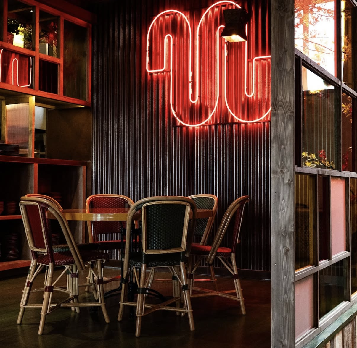
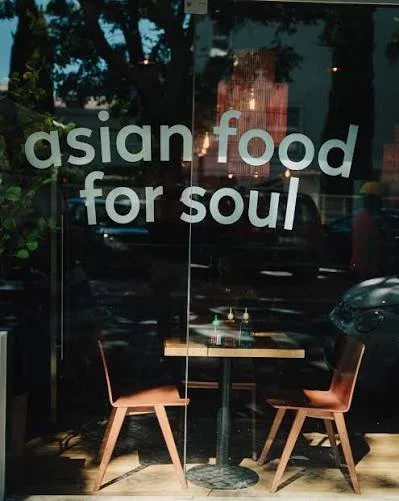
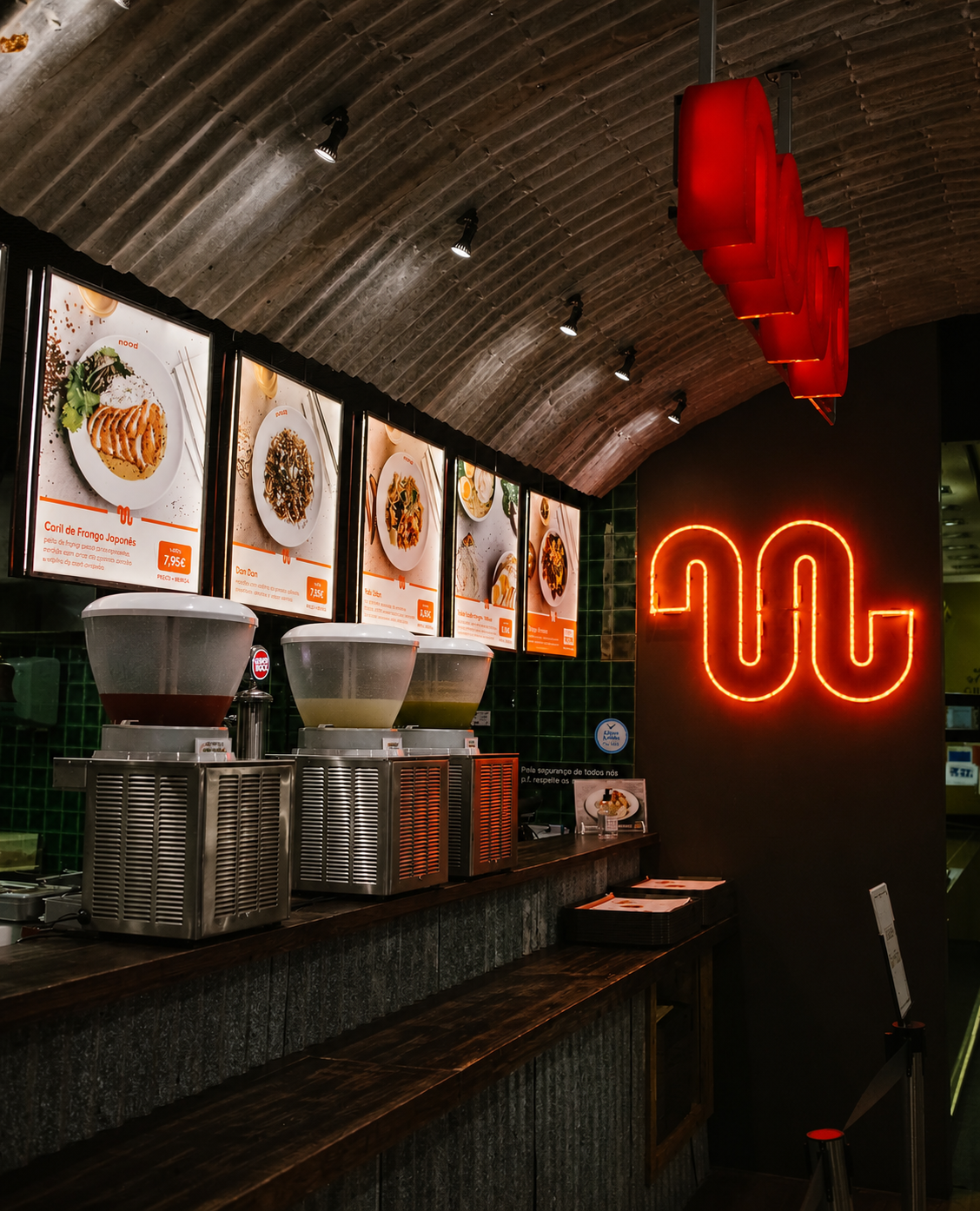
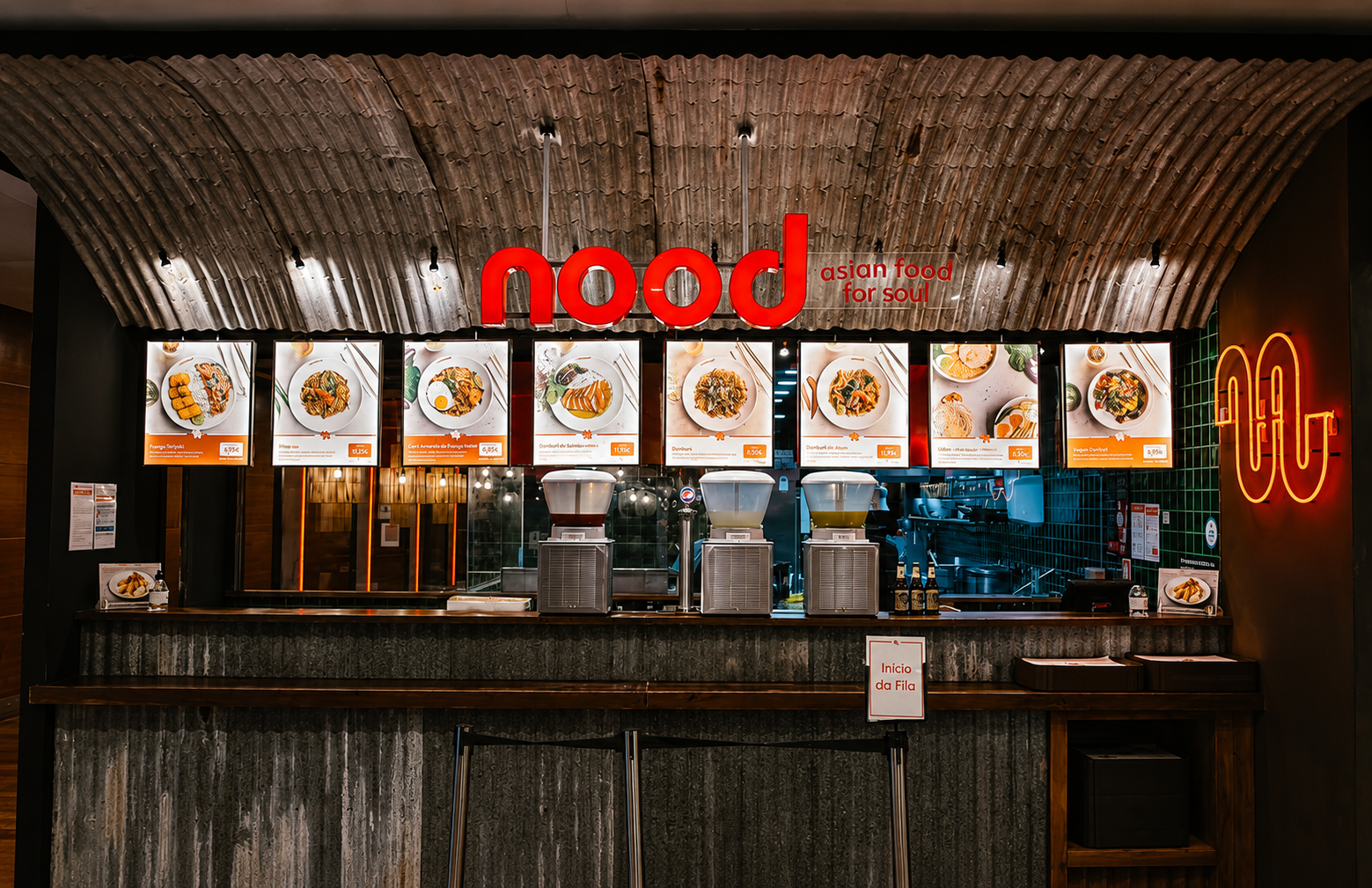
A mall location plays by different rules entirely, not a destination someone seeks out, but a choice made in passing, competing for attention against a dozen other options in the same sightline. The audience shifts too, less the loyal Chiado regular, more someone deciding in seconds whether to stop. So the brand had to do more of the convincing, faster: the same materials carried through the interior, the neon sign kept as a non-negotiable, and all-new menu boards built in corten steel. The food photography used to sell that decision was styled and art directed from scratch for the format, shot to work at a glance, not just as documentation, since in a mall, the picture often is the pitch.